How To Change Scrollbar Mode Using WPF Skinmanager?


The SfSkinManager allows you to apply various scrollbar styles like Windows 10 compact scrollbar, for both Syncfusion® and Framework controls using the ScrollBarMode property, which will be available only in themes supported by theme studio.
The ScrollBarMode enum contains the following values:
Default- The ScrollBar will be displayed with the default look of a thumb along with up and down arrow to scroll.Compact- The Windows 10 like compact scrollbar will have the look of a thin layer of thumb until the user hovers over the scrollbar area.
N> The Compact scrollbar mode is enabled by default in the WPF Fluent Theme and WPF Windows11 Theme.
This sample demonstrates how to use the ScrollBarMode property in a WPF application using Syncfusion's SkinManager. It loads a DataGrid and a Chromeless Window with compact scrollbar styles, showcasing the visual differences between modes.
Features
- Configurable scrollbar modes: Default and Compact
- Applies to both Syncfusion controls (e.g., SfDataGrid) and standard WPF controls
- Easy integration with theme applications
- Hover-to-expand functionality in Compact mode for better usability
Configuration
Setting ScrollBarMode in C
To set the ScrollBarMode programmatically, use the SfSkinManager:
using Syncfusion.SfSkinManager;

SfSkinManager.SetTheme(this, new Theme() { ThemeName = "MaterialDark" });
SkinManagerHelper.SetScrollBarMode(this, ScrollBarMode.Compact);
Build and Run
- Clone or download the project.
- Open
DataGrid_Themes.slnin Visual Studio. - Restore NuGet packages.
- Build the solution.
- Run the application to see the DataGrid and Chromeless Window with compact scrollbars.
Ensure Syncfusion licenses are configured if required.
Demos and Examples
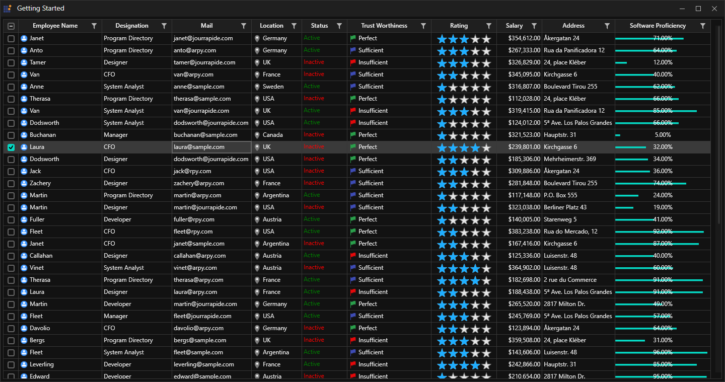
The sample includes a DataGrid populated with employee data, demonstrating scrollbar functionality. Experiment by switching between Default and Compact modes in code.
Screenshots
 1096
1096